🗺️ Wayfinding for the World Trade Center and Beyond
“When Westfield acquired the rights to operate all retail at the World Trade Center, it was a huge win for the company. The WTC was the company’s top focus for years. This wayfinding system was Westfield Lab’s first mark on the company’s highest priority, and all eyes were on us.”
Goal: Create a way finding system for the WTC that:
- Helps NYC tourists and daily commuters alike make sense of a labyrinthine space
- Is harmonious with the world-class architecture that contains it
- Respects of the tragedies that took place at the site
- Complies with all relevant regulations in the American's with Disabilities Act (ADA)
- Establishes a wayfinding foundation that scales up to all Westfield properties
My Role: Full stack design
🔍 Early discovery and definition. I helped define the design approach to this project
💭 Concepting for the kiosk hardware
✏️ Interaction design for kiosk software, desktop web, and mobile
🔬 Validation research for the kiosk software
🔍 Early discovery and definition

Customer Intercepts at directory
We intercepted people using physical directories to ask what they were looking for, how they were finding it, and what they were going to do after leaving the directory.
Pinterest Inspiration
In Pinteresting maps, I uncovered some exciting patterns, like one where location info and quick directions are shown at the top of monoliths to give people really fast directions. You’ll see how this made an appearance in our designs later on.
Synthesizing into 2 guiding frameworks

Journeys
Our intercepts identified 4 distinct modes in which visitors need wayfinding help, one of which are displayed here. "Find" was a targeted hunt for a very specific location.
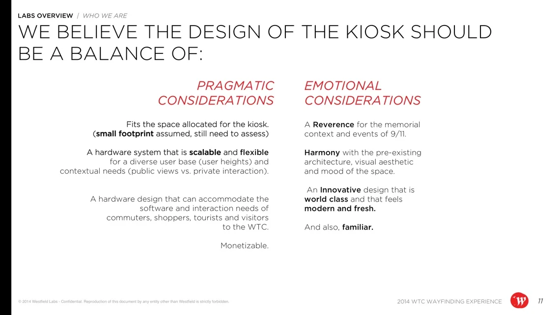
Principles
Stakeholder interviews, inspiration, and spec reviews led to these 8 principles, balancing pragmatism with emotional aspirations.
💭 Hardware concepting


Monolith or Tablet?
Is it a large screen or small screen? Both have pros and cons. Large screens can be a beacon that draws people from afar. Alternatively, small tablets provide a private, personal interaction. We ended up prototyping both. Having both large and small screens brought modularity to the kiosk design, which could allow us to cater to a variety of situations.
Anatomy of a Monolith
Field-of-view was a major factor in placing UI elements. From far away, it’s easy to see the entire screen, but up-close, the field-of-view is dramatically limited. Reach was also a major consideration. I also created the diagram to the right to communicate field-of-view and reach requirements to stakeholders.
3 Hardware Concepts
Final concept sketches by Will Springer

Parallel Screens
Multiple tall two-sided screens arranged In parallel provide private spaces for user interaction in between the displays. Users can literally walk through them, without disrupting the flow of traffic.

The Digital Garden
Displays as sculptural forms that complement Calatrava’s design but together create a garden-like atmosphere without interrupting the flow of traffic for commuters.

Momentary Respire
Also Calatrava inspired, a variation of the previous concept suggests a covered architectural space for users to stand within. Details are outside the view of passers by, but discreetly visible inside the protective shell-like structure.
✏️ Software design

The software design process required a lot of sketching, printing, and editing.

An early overview of how the initial screens related to each other

An example of the output of the team's many software design meetings
How much map belongs on the screen?
A big question was how much of the initial screen should be dedicated to the map vs. the directory. The map immediately and strongly reads as a wayfinding system, but in the majority of use cases, it was only useful for routing at the end. On the other hand, the directory helped people visually recognize stores they were looking for and navigate more efficiently. We ended up weighting map and directory equally to experiment on what worked best.

An exploration with a lot of space dedicated to the map
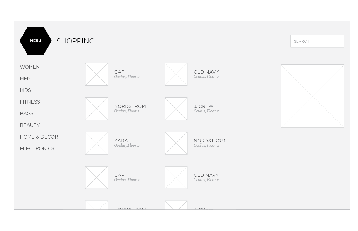
An exploration with very little space dedicated to the map
Results across multiple buildings with multiple floors
Because the World Trade Center contains multiple buildings, each with multiple floors, we needed to make some calls on how results showed up across all buildings, a single building with multiple floors, and a single floor.

One exploration for results in a single building across floors

An exploration for results in across all buildings
Testing reachability as we design
The Americans with Disabilities Act (ADA) rightly has very specific requirements about the usability of kiosks, especially those being built for government agencies like the MTA. We had to make sure the UI would be touchable by people in wheelchairs and by people with a variety of disabilities. I created a foam-core approximation of our large screen (left) using dimensions from the hardware engineers. We printed designs and tested on this approximation.

🔬 Prototyping and Research


What we did
Developers quickly created an extremely rough prototype of the hardware and software, and the team went to Westfield Valley Fair in San Jose to research the design over the course of one week. We used a sprint-style method where we researched Monday, Wednesday, and Friday, and used Tuesday and Thursday to design and update the prototype.
Key Outcomes
Surprisingly, groups used both the large screen and the small screen for making decisions together. We thought the large screen would invite more social interactions. The differences between large and small screen were minimal, so we made the decision to kill the small screen.
We realized that the entire experience hinged on orienting people correctly and easily. We needed to do everything we could to not just to show people where they were, but where they were facing, and how their orientation would change as they moved.
Seeing it all come together

Due to timeline troubles, we ended up launching in LA before NYC.

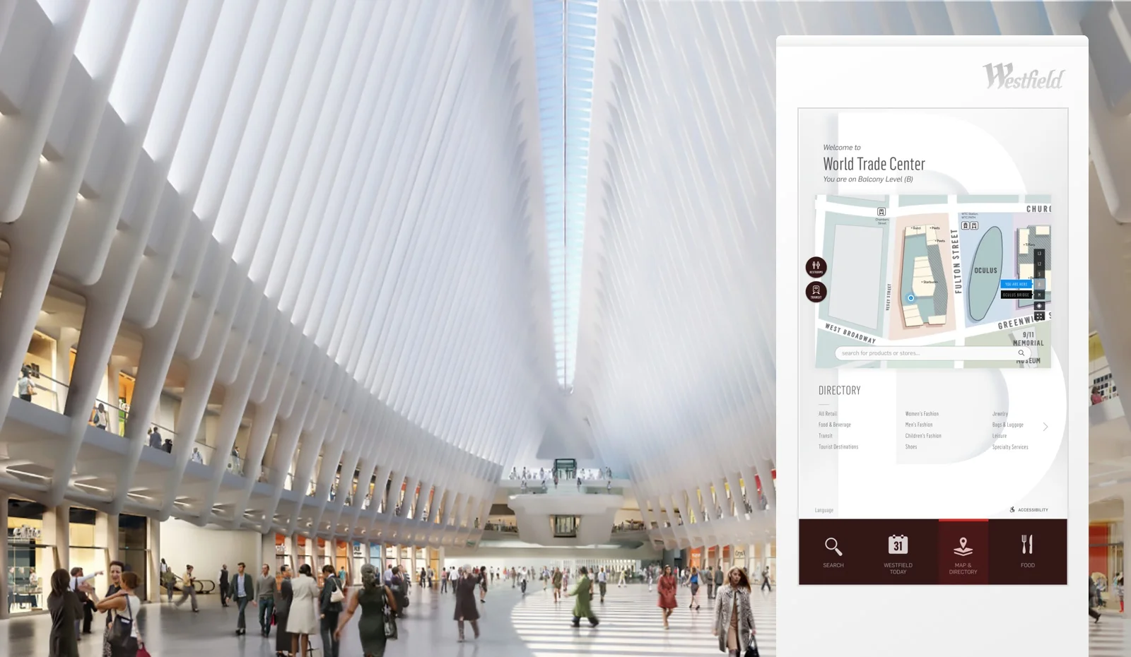
A peek at the digital directory with full visual design for NYC.
Learnings from research were implemented by a group of visual designers, and I rolled off the project to focus on other efforts. These videos provide a peek of where we ended up.
🎉 Bonus!
Extending to Desktop and Mobile
I also worked on extending our wayfinding solution to mobile and desktop. Here are some bonus wireframes from that process.

4 Explorations of how floor switching could work on mobile.

An exploration of results views on the desktop map.
Additional designers:
Amir Bahadoori (Creative director), Christine Liao (UX, Visual), Jonathan Hung (UX), Hector Ayon (Visual), William Springer (Illustrator)